One Outlook
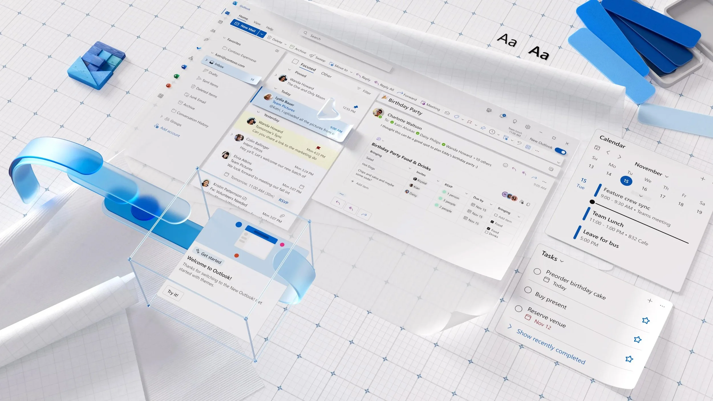
One Outlook is the future of Outlook. Our team delivered a consistent and adaptable journey for customers, spanning from free users to commercial super-users. A convergence of big-screen Outlooks on Windows, bringing the best from each. One product, a single codebase that adapts to various scenarios from the free email Web client to the installed app at work; with every single piece of innovation available, enabling the user and business to customize their experience.
As Principal Designer, I conceived the vision for One Outlook and galvanized stakeholders and partner teams to support my proposal. In December 2020, I was entrusted with leading a team of five designers to execute on the One Outlook vision, with a primary focus on shipping to Dogfood for beta testing with enterprise customers. Additionally, I forged strong partnerships across disciplines and the Office and Windows organizations, enabling us to deliver a cohesive and collaborative product that met the highest design and engineering standards.
Design Team: Donna Seo (Design Manager), Christina Ergonis (Monarch Visual System Lead), Dana Shin (Designer), Rüdi Kinast (Monarch Calendar Design Lead), Sana Ali (Designer), Brandon Haist (Researcher), Colin Moll (Motion Designer), Suz Alphin (Icon Designer)
Partners: Tasha Lutfi (Design Director of Outlook), Dave Meyers (Program Manager), Lizzie Parker (Program Manager), Margie Clinton (Program Manager), Scott Stiles (Program Manager), Victor Wang (Program Manager), Ben Carter (Engineering Manager), Brian Stanhope (Engineering Manager), Elena Catrinescu (Engineering Manager), Kevin Clement (Engineering Manager), Robert Novitskey (Engineering Manager), Russell Simpson (Engineering Manager)
New Outlook for Windows available to all Office Insiders by Margie Clinton
Designing a New Outlook Experience by Tasha Lutfi
Our mission was to design a consistent experience for everyone and every stage of life.
Email and calendar play an essential role in all stages of a person’s life. But, unfortunately, we didn’t have a good solution that delivers a familiar Outlook experience throughout this journey. One Outlook will be the product that seamlessly scales and migrates with you across all these stages without drastically different experiences.
Historically, Outlook’s product team was divided by platform. As a result, it would take six teams to ship one feature resulting in different experiences due to technical limitations or varying user needs. For example, in some cases, a feature would take two months to ship in Web, where it would take two years to ship in Outlook on Windows.
“I have to use different Outlooks to get Outlook’s full functionality.”
Dissatisfied Customer
Principles
Design changes should be seamless and non-disruptive to the user's workflow. Users must be able to jump in and continue their work without any issues. Keeping essential control placement on the surface consistent is critical. Users should know where to look, even if the UI is subtly updated.
Establish an information architecture that is user-friendly and flexible. We need a clear next step for Outlook on Windows existing users, while at the same time, we need an all-up Outlook framework that builds a design system capable of enabling a range of experiences from Consumer to Enterprise.
Drive towards Office’s shared design language.
One Outlook Mail with Single Line Command Bar in Large Density
I proposed a North Star for what One Outlook could become, incorporating the best and most delightful features from across various Outlook platforms.
Using our North Star as a guide, we thoughtfully prioritized the work into manageable phases. One Outlook was going to be an ongoing journey, and as we gathered feedback from our customers and released updates to Windows and Web, our North Star would continue to evolve.
Refreshed and Coherent Design System
We needed to marry the Windows and Web systems and workflows. Part of the challenge was managing varying timelines and optimizing controls. This process required user testing, customer calls, interviews with area experts, and collaboration across Office and Windows.
Designing for Densities
Densities impact the size and spacing of components. Densities will not affect the type of information that is shown or hidden. A large group of customers is susceptible to the information density on their screen. It was essential to preserve this as we built One Outlook.
Preserve information density for Outlook Windows customers
Flexible System of Command Bars
We are delivering three types of command bars: single-line, simplified, and multi-line (classic). The command bars will be responsive, customizable, and contextual.
Personalize Experiences
Outlook allows customers to highly customize their layouts. However, each platform offers different settings, and all do not roam. Therefore, the challenge was to consolidate controls and deliver a thoughtful approach to settings.
Compact message list (left) and single-line message list (right)
More Added Value
We wanted our customers to find value in One Outlook. It needed to feel like an upgraded experience. As we consolidate features and, in some cases, deprecate features, we wanted to add value back to the product by designing features our customers always wanted to see, for example, Teams integration such as quick chat in Outlook.
One Outlook is a journey.
After six years at Microsoft, five of which were spent at Outlook, I decided to move on in July 2021. In November 2022, following a complete code rewrite, One Outlook was finally available for beta testing with enterprise customers. I am extremely proud of the team who carried on the project and made it a success. One Outlook was a massive undertaking, and I am excited for the world to experience it.


